Good design results in a workspace that feels good to visit and spend time in – but get it wrong and your company can suffer a host of ill-effects, from loss of potential business due to poor presentation, right through to employee absenteeism from health effects and lowered morale. We take a look at the most common design mistakes so they can be avoided in future.

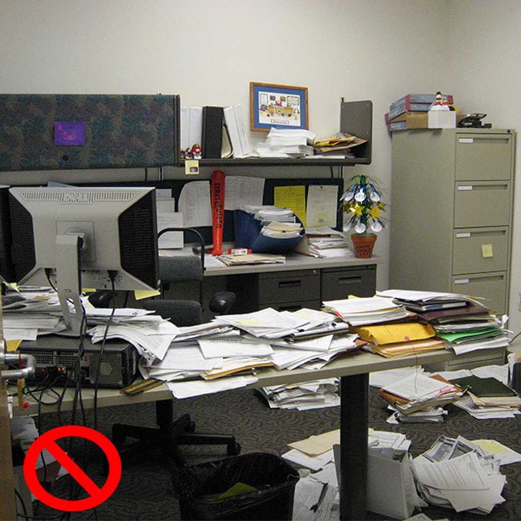
Before you begin, make sure you know exactly what you want to achieve – and be realistic with your budget. This also extends to details such as spatial planning – for example, you want to be sure that furniture is the correct size for the space you have available before you buy it. Also try to avoid buying pieces on a whim without considering whether they’ll fit in with the overall ‘look’ of your office.
Obviously, light is necessary so people can see what they’re doing, but the type of lighting you use can also have a strong effect on people’s mood, motivation levels and health. It’s important to strike the right balance – if there isn’t enough light, people will be straining to focus on their tasks, while light that is too intense can cause a range of health problems, such as headaches and anxiety.

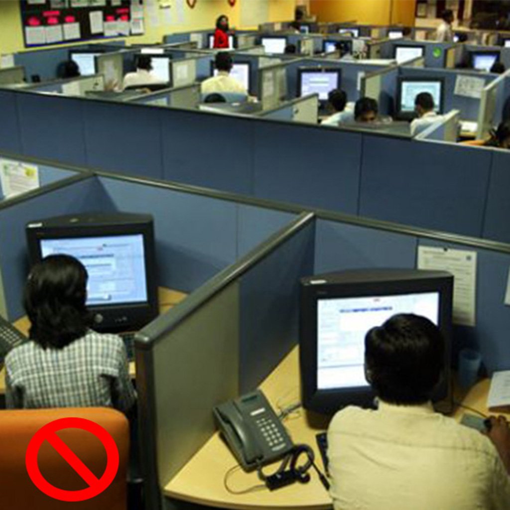
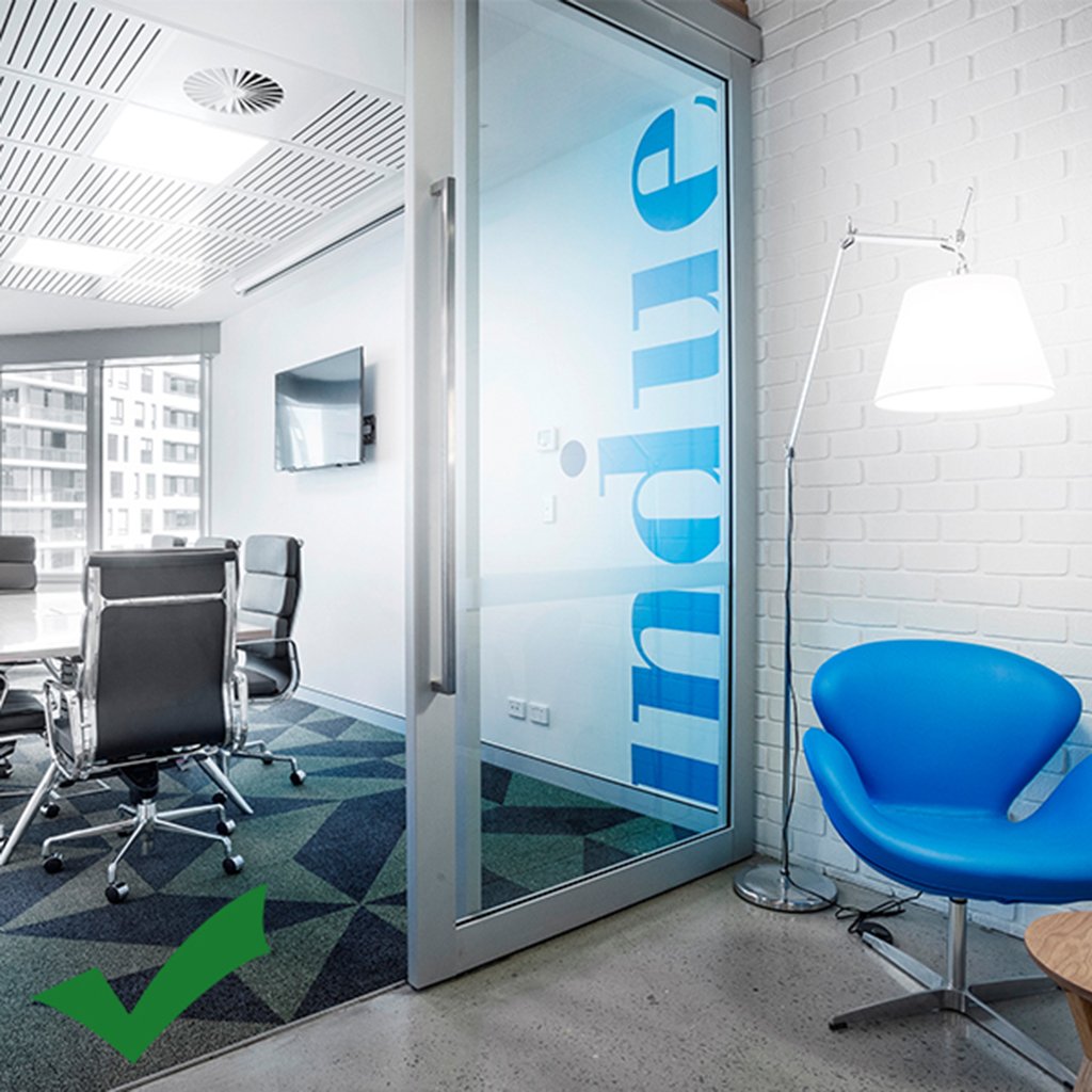
This isn’t about having a huge office area – with effective planning and design, even small spaces can be made to feel comfortable and compact rather than cramped. Choice of colours and materials can assist here – for example, painting walls in cooler colours rather than darker ones can make a space seem larger, and using glass partitioning can give a sense of airiness and expansion.
4. No balance between private and collaborative work spacesIt’s important for employees to have access to both private and collaborative work spaces; collaboration at work encourages connection, innovation and a strong company culture, while private work spaces foster concentration, learning and focus. A combination of both is necessary to provide a fully-rounded culture in your office, leading to the best work results.
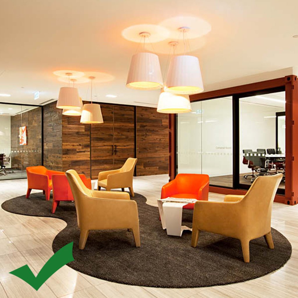
A cohesive interior, with a particular design vision running throughout, can create feelings of orderliness and calm. It can also be harnessed to express your brand identity through colour, pattern and materials. Whenever someone enters your office, you want them to have a strong sense of the ideals your company represents, as well as to feel welcome and comfortable in your corporate space.

Many businesses underestimate the importance of their reception area, but whether they’re clients, visitors or employees, it’s the first part of your building that many see – and for some, it’s the only room they’ll see. This makes it extremely important to make a good impression and to lay all your wares out on the table. You want this space to be welcoming, comfortable and professional, as well as practical enough for your receptionist to easily carry out their daily duties.
Though it’s tempting to save dollars by trying to do it yourself, investing properly in the design of your workspace can actually save you money in the end. Engaging a professional isn’t just about making your office look nice (although this is important!). There’s also a host of other aspects that a trained space planner and designer knows to take into account, such as maximising space, effective and attractive branding, and health and safety considerations. Working with a professional will set you up with an excellent space right from the beginning that’s built to last, and will stop you having to spend money further down the line correcting things.

Whether you have a smaller space or a large one – there’s an office design that’s right for you.
Criterion can direct you to industry leaders who can manage your project.
Criterion works with Architects, Builders and Contractors by supplying wall, window and door systems and expert guidance to achieve the result your company needs.